
The Logo and Its Meaning
Hue Knows is a little joke about being a colorblind artist. It sounds like “who knows?” because a lot of the time, I don’t actually know what colors I’m using.
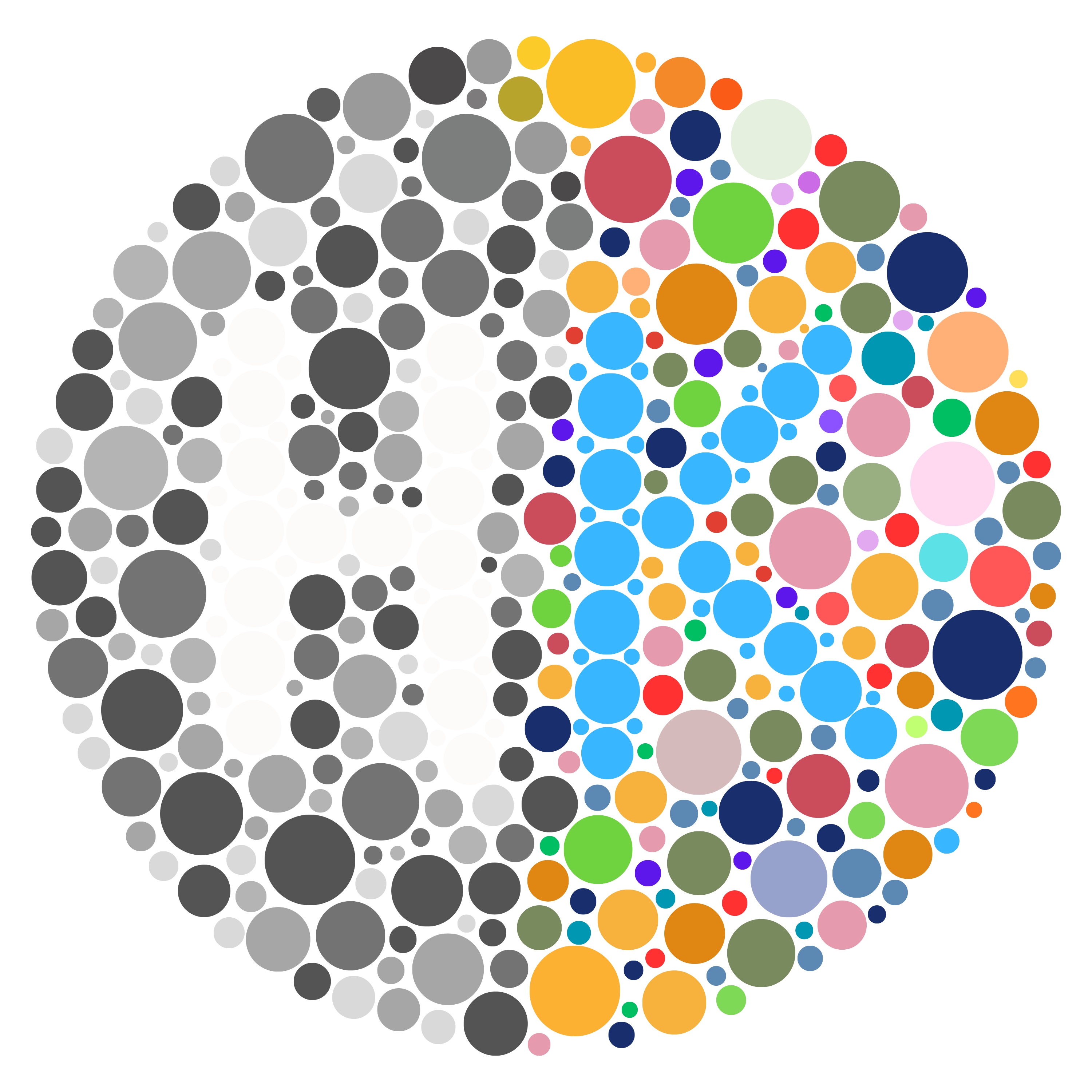
The logo is inspired by the Ishihara color blindness test, with the letters built from a field of dots. It reflects my experience of seeing the same image differently.
The black and white half represents where my paintings begin: original photographs I take. The right half represents the color I add by hand, turning those photographs into paintings shaped by my memories, emotions, and perspective.
About the Artist
My name is Nate, and I’m the artist behind Hue Knows. My work begins with photographs I’ve taken over the past 17 years. Photography started as a hobby and a creative outlet, but it gradually became a way to express what I was feeling through the places and moments that caught my attention.
I began photographing in color, following what I saw around me in the industry and challenging myself to make strong images despite my color blindness. As I grew and developed my own perspective, I became more interested in the stories within those images. That drew me toward black and white, where light, contrast, and composition could bring a feeling into focus without the distraction of everyday color. I keep my camera in monochrome mode so that intention guides me from the moment I take the photograph.
When I discovered gel printing and painting, I found a way to revisit those photographs and express more of what they meant to me. Working by hand lets me build color and texture around the emotion of a memory, without being tied to how the scene originally looked. The same photograph can become a different painting depending on where I am in my life and what I need to say.
That connection between memory, emotion, and making has become an important part of my mental health journey. Art gives me a healthy outlet to process what I’m feeling and find moments of healing. Hue Knows grew from that practice, bringing my photography and painting together as an ongoing way to understand and share my experiences.
The Process
Each painting begins with my own black and white photographs. Every photograph means something to me, and many carry a specific story. I choose and combine them according to what I’m feeling and what I want the painting to express.
I begin with a printed copy of a photograph and a thin layer of black paint rolled onto a gel plate, a soft, reusable printing surface. I lay the photograph face down and gently press it against the paint. Different areas of the printed photograph resist or absorb the paint, leaving its pattern in paint on the plate when I lift the paper away. No part of the photograph stays behind.
That painted impression becomes the foundation for the work. I carefully build layers of color over it, planning how each addition will interact with the image and the layers already in place.
The order matters because I’m building the painting from its visible front toward its back. The black image goes down first, followed by the layers that will sit behind it in the finished work. As those layers accumulate, they gradually cover my view of the earlier details. I rely on preparation, careful placement, and experience to keep working toward the composition I envision.
When the layers are ready, I press paper against the painted surface to transfer the painting from the plate. Lifting away the gel plate reveals the finished side, bringing the image, textures, and layers together into one composition.
The way I treat the photographs reflects a particular moment in my life. Sadness, nostalgia, anger, or happiness can shape what I emphasize, what I conceal, and where I add color. As a colorblind artist, I may not always be able to name the colors I’m using, but I know the memories behind the photographs and the feeling I want to communicate.
Even when I return to the same photographs, each rendition is a distinct painting. It carries its own appearance and its own story of why I made it that way, at that moment.